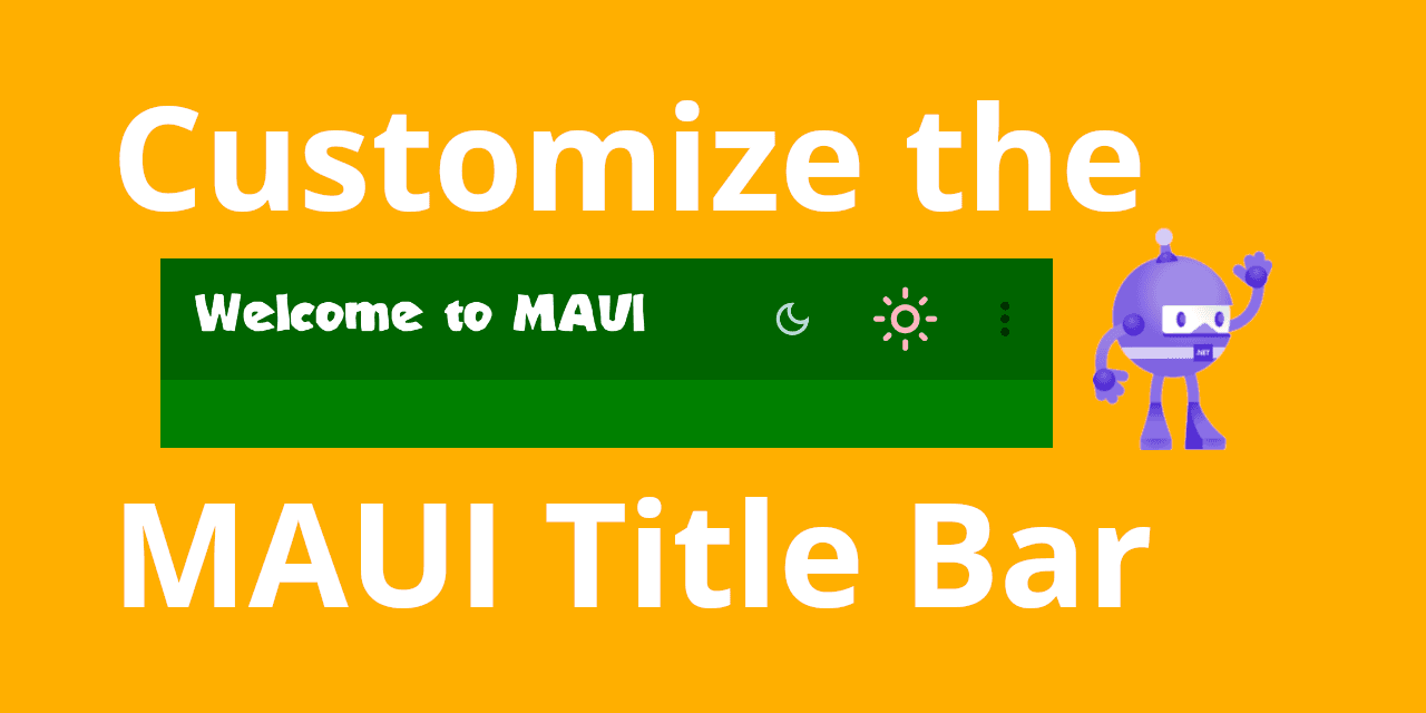
Customize the Title Bar of a MAUI app with these simple steps
Add custom fonts, title, buttons and a secondary menu to the navigation bar of your .NET MAUI Shell app.
I am a passionate mobile app and software developer with a focus on C# .NET, Xamarin.Forms and .NET MAUI.
Introduction
Many mobile applications come with their own, custom title styling. This is important, because the title bar (or navigation bar, I will use the terms interchangeably here) plays a vital role in brand recognition since it is visible at the top of an app.
In this blog post, I will show you how you can customize the navigation bar of a .NET MAUI Shell app. The goal is to add a custom font, title and some buttons to it. The final result will look like this:
You can find the example code for this blog post in my MAUI Samples repository.
Prerequisites
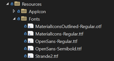
Before we can start with the customization of the TitleView, we need to add some fonts. I'm using MaterialIconsOutlined-Regular.otf for the icons (available in the Google Material Icons GitHub repository) and Strande2.ttf for the Title.
Adding font files couldn't be simpler in .NET MAUI, we just need to add them to the Resources/Fonts/ directory of our MAUI app project and register them:
It's not necessary to set the Build Action for each file to MauiFont separately, because this happens automatically as long as the files are added to the Fonts directory. We can see why this works when we edit the .csproj file, where we will find the following:
<!-- Custom Fonts -->
<MauiFont Include="Resources\Fonts\*" />
This means that adding the font files to the Fonts directory is all we need to do, they will be picked up as MauiFont files automatically.
Then, we just need to register the fonts in our MauiProgram.cs and we're good to go:
public static class MauiProgram
{
    public static MauiApp CreateMauiApp()
    {
        var builder = MauiApp.CreateBuilder();
        builder
            .UseMauiApp<App>()
            .ConfigureFonts(fonts =>
            {
                fonts.AddFont("OpenSans-Regular.ttf", "OpenSansRegular");
                fonts.AddFont("OpenSans-Semibold.ttf", "OpenSansSemibold");
                fonts.AddFont("MaterialIconsOutlined-Regular.otf", "MaterialIconsOutlined-Regular");
                fonts.AddFont("MaterialIcons-Regular.ttf", "MaterialIcons-Regular");
                fonts.AddFont("Strande2.ttf", "Strande2");
            });

        return builder.Build();
    }
}
We can now access the fonts by their name (excluding the file extension). More on that a bit further down.
First, it's time to start with the customization of the TitleView.
Customizing the Title Bar
Let's start with the background color, then we'll customize the title and finally, we'll add some buttons.
Background Color
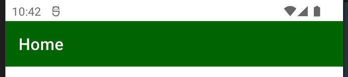
In a MAUI Shell app, we can access and control the style of the navigation bar in the root of any ContentPage.
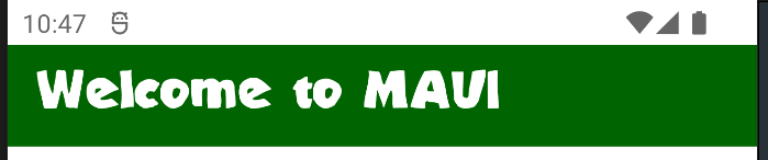
In order to change the background color of the navigation bar, we can simply set the Shell.BackgroundColor to any valid value, either a named color (e.g. "DarkGreen") or a hex code (such as "#01AB67"):
<ContentPage
  x:Class="MauiSamples.Views.MainPage"
  xmlns="http://schemas.microsoft.com/dotnet/2021/maui"
  Shell.BackgroundColor="DarkGreen">
  <!-- ... -->
</ContentPage>
This will give us the following:
Cool, we have a green background. Next, we'll change the font and text.
Title Font and Text
In a MAUI Shell app, you can set an entirely custom TitleView, which means that you can add all kinds of views into the TitleView, such as Layouts, Labels, Buttons, Images, and so on. In this blog post, I'll keep it simple, so we'll just add a HorizontalStackLayout with a single Label.
Since we've already added our custom font, we can now use that in the Label by setting the FontFamily="Strande2". We can set the custom TitleView like this by setting the Shell.TitleView property:
<Shell.TitleView>
  <HorizontalStackLayout VerticalOptions="Fill">
    <Label
      Text="Welcome to MAUI"
      FontFamily="Strande2"
      TextColor="White"
      VerticalTextAlignment="Center"
      VerticalOptions="Center"
      HeightRequest="50"
      FontSize="Medium" />
  </HorizontalStackLayout>
</Shell.TitleView>
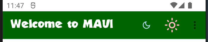
Our TitleView now looks like this with a green background, as well as a custom font and title:
The only thing missing are the buttons. Let's do that next using ToolbarItems.
Toolbar Items
MAUI gives us different options to add buttons to the navigation bar. One of them would be to add more elements to the HorizontalStackLayout inside our custom TitleView. Another way is to use ToolbarItems, which is what we'll do for the buttons.
While adding Buttons and Images to the TitleView directly gives us more control over their appearance, especially their position, ToolbarItems have the advantage that they position themselves according to the order they are defined in. They are right-aligned by default, with the first item being the left-most. This means that new items will be added to the right, while existing items are shifted to the left.
ToolbarItems can either use text or icons. For icons, the ToolbarItem class comes with an IconImageSource property, which is of type ImageSource. This means that we can also use a FontImageSource to provide the icon for our buttons based on a custom font.
You can find more information on Icon Fonts in MAUI in the official documentation.
Let's add the first button using such a FontImageSource by using the MaterialIconsOutlined-Regular icon font:
<ContentPage.ToolbarItems>
<ToolbarItem Command="{Binding SetLowBrightnessCommand}">
<ToolbarItem.IconImageSource>
<FontImageSource
FontFamily="MaterialIconsOutlined-Regular"
Glyph=""/>
</ToolbarItem.IconImageSource>
</ToolbarItem>
</ContentPage.ToolbarItems>
The FontFamily property is used to select the icon font and the Glyph property is used to set select the specific icon. The ToolbarItem also supports binding to a Command from our ViewModel.
Note: Google offers a user-friendly cheat sheet to view the Material Symblos and Icons including their code points. The code point of the Glyph in this example is
e51c. Glyphs are individual characters from a character set or font and use the"ODE;"notation.
Adding the first ToolbarItem gives us the following:
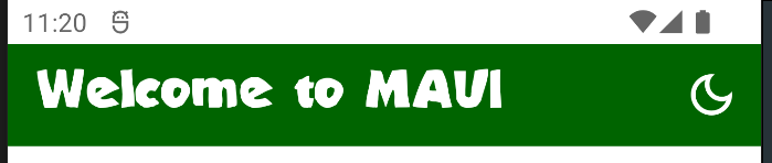
As you can see, the ToolbarItem is completely right-aligned, we didn't have to specify the size or position for that.
Let's add another ToolbarItem below the first one in the XAML code to see what happens:
<ContentPage.ToolbarItems>
<ToolbarItem Command="{Binding SetLowBrightnessCommand}">
<ToolbarItem.IconImageSource>
<FontImageSource
FontFamily="MaterialIconsOutlined-Regular"
Glyph=""/>
</ToolbarItem.IconImageSource>
</ToolbarItem>
<ToolbarItem Command="{Binding SetHighBrightnessCommand}">
<ToolbarItem.IconImageSource>
<FontImageSource
FontFamily="MaterialIconsOutlined-Regular"
Glyph=""/>
</ToolbarItem.IconImageSource>
</ToolbarItem>
</ContentPage.ToolbarItems>
This gives us the following result:
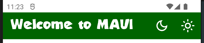
As expected, the first ToolbarItem shifted to the left, the second one got added right to it and the entire collection of ToolbarItems remains right-aligned.
Customizing the Toolbar Items
Each ToolbarItem can be configured based on your needs. For example, you can set different colors for each FontIconSource and even change the size of each:
<ContentPage.ToolbarItems>
<ToolbarItem Command="{Binding SetLowBrightnessCommand}">
<ToolbarItem.IconImageSource>
<FontImageSource
FontFamily="MaterialIconsOutlined-Regular"
Glyph=""
Color="LightBlue"
Size="20"/>
</ToolbarItem.IconImageSource>
</ToolbarItem>
<ToolbarItem Command="{Binding SetHighBrightnessCommand}">
<ToolbarItem.IconImageSource>
<FontImageSource
FontFamily="MaterialIconsOutlined-Regular"
Glyph=""
Color="LightPink"
Size="32"/>
</ToolbarItem.IconImageSource>
</ToolbarItem>
</ContentPage.ToolbarItems>
This will result in something like below:
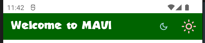
As you can see, those items have different sizes and colors - pretty cool!
Secondary Toolbar Items
Adding more and more items would eventually leave no more space for the title, which would at some point get covered by ToolbarItems:

Therefore, if we wanted to add more items, we can do so by placing them into a secondary toolbar menu. Secondary ToolbarItems can be defined by setting their Order property to Secondary:
  <ContentPage.ToolbarItems>
    <!-- ... -->
    <ToolbarItem
      Order="Secondary"
      Text="Item 3" />
    <ToolbarItem
      Order="Secondary"
      Text="Item 4" />
    </ToolbarItem>
  </ContentPage.ToolbarItems>
If secondary ToolbarItems are defined, a little burger menu icon appears on the right of the tool bar:

The secondary items only become visible after tapping the burger menu:
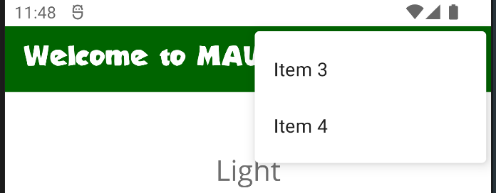
Note: Secondary-level ToolbarItems do not support icons, only text will be shown.
And that's it, we're done. 🏆 Awesome, you just learned how to customize the TitleView of a .NET MAUI Shell app! 💪
Conclusion and next steps
Using custom fonts, a custom TitleView and some ToolbarItems, we can quickly mesh up our own customizable title bar to make our app stand out. I hope you learned something new today.
There are several different ways to customize the look and feel of the navigation bar (or title bar) in a MAUI app and I've just shown you one way of doing it with the least amount of effort. Platform-specific customizations are also possible, but that would require an entire article on its own (let me know if you're interested in such an article!).
If you enjoyed this blog post, then follow me on LinkedIn, subscribe to this blog and star the GitHub repository for this post so you don't miss out on any future posts and developments.